M4.C1: Crafting A High-Converting Homepage
Your homepage is often the first handshake between you and your potential customers.
It's where your visitors decide whether to stick around, explore your content, and eventually click through your affiliate offers.
In affiliate marketing, where trust and clarity are everything, crafting a high-converting homepage isn't just a nice-to-have, it's a necessity.
In this chapter, we'll walk through how to plan, structure, and write a homepage that not only looks good but actively encourages visitors to take action.
Let's begin!
Disclosure: Some of the links I share might be affiliate links. If you click on one and make a purchase, I may earn a small commission as a thank you. But don’t worry, it won’t cost you anything extra. I only recommend stuff I genuinely believe in. Your support helps me keep creating awesome content. You can read my full affiliate disclosure in my disclaimer page.
If you want to save a lot of hours searching for high-paying affiliate programs, check out our exclusive list of 2500+ affiliate programs. You’ll find all the information about the programs inside the list. This list is perfect for affiliate bloggers and influencers.
Role Of Your Homepage In Affiliate Marketing
Unlike a traditional company website where the homepage might focus heavily on branding or corporate storytelling, an affiliate marketing homepage has a slightly different mission.
Your main goal is to guide visitors toward valuable information and present helpful resources that naturally incorporate your affiliate promotions.
Think of your homepage as a well-organized airport terminal.
You don't want travelers wandering around confused, you want them smoothly moving from the entrance to the right gate.
In affiliate marketing, your homepage needs to do three main things: quickly explain what your site is about, make visitors feel like they're in the right place, and guide them toward your best content.
A well-crafted homepage acts like a friendly concierge, directing readers to blog posts, reviews, buying guides, or comparison articles where they can find the solutions they're seeking.
If you can make this first impression a great one, you'll dramatically increase the chances of them clicking your affiliate links later.
What Visitors Expect from Your Homepage
When someone lands on your homepage, they're usually looking for one of a few things.
They might want to know what your website is about, find specific information, browse your latest or best content, or simply see if they can trust you as a source.
If they can't figure out within a few seconds what you offer and where to go next, they're likely to hit the back button.
That's why it's so important to design your homepage around your visitor's journey.
Visitors should immediately understand the purpose of your site.
If your niche is "home workout equipment," your homepage should make that crystal clear right away.
If your site focuses on "budget travel tips," visitors should pick up on that instantly.
Once the message is clear, your homepage should then guide them toward the next logical step, whether that's exploring reviews, checking out comparisons, or reading buying guides.
The easier and faster you make it for people to find what they need, the more likely they are to trust you.
And in affiliate marketing, trust directly translates to higher conversions and more commissions.

Essential Elements Of A High-Converting Homepage
Every high-converting affiliate homepage shares a few essential elements, and you don't need a fancy design to make it work.
First, you need a strong, clear headline that immediately tells visitors what your site offers.
Think of it like your elevator pitch, short and punchy.
If someone reads your headline and intro paragraph, they should instantly understand the value you provide.
Next, a brief welcome or introduction can work wonders.
In just a few sentences, explain who you are (or what your brand stands for), what topics you cover, and why someone should trust your content.
You're not writing a full biography here, just enough to create a human connection.
After the intro, feature your best or most important content.
This could be a few highlighted articles, product roundups, or resource pages.
Spotlighting your top content helps guide visitors toward posts that have the highest potential for engagement and affiliate conversions.
You might also include a simple call-to-action like "Start Here" or "Browse Our Top Picks" to gently steer them in the right direction.
Optional elements, depending on your site's maturity, could include a featured product section, a brief testimonial or user review snippet, or even an email signup form if you're ready to start building a list.
But at its core, your homepage only needs to do a few things very well: clearly communicate your purpose, build trust, and guide action.
Structuring Your Homepage For Maximum Impact
When it comes to layout, the most effective homepages follow a natural storytelling flow from top to bottom.
At the very top, your hero section (the first thing visitors see) should have a clear headline and a short description.
This area sets the tone and immediately tells people why they should stick around.
Beneath the hero section, you might highlight your most important articles or categories.
You can group these into sections like "Top Reviews," "Buying Guides," or "Latest Articles" depending on what makes sense for your niche.
If you have several content categories, you might display a grid or list linking to each one.
This not only helps visitors find their interests faster but also encourages them to explore more pages.
As you move down the page, you can add a few more layers like a short feature about your site's mission, a few quick stats if you have them (like "helped 500+ readers choose the best gear"), or a resource library section linking to your biggest guides.
Always make sure every section on your homepage has a purpose.
Avoid adding random widgets, stock images, or blocks of text that don't drive the visitor closer to engagement.
At the bottom, a final call-to-action can help wrap things up.
It might be something like checking out your latest reviews, joining your email list, or browsing your top guides.
The goal is to keep the journey going.
Compelling Homepage Content that Builds Interest
The words you choose for your homepage matter just as much as the layout.
In fact, they might matter even more.
When writing your homepage copy, it's best to imagine you're welcoming a new friend into your space.
Your tone should be friendly, approachable, and confident without being pushy or salesy.
Start with a hook that quickly states the problem you solve or the value you offer.
For instance, "Looking for the best gear to set up your dream home gym? You're in the right place."
Simple, direct, and inviting.
Then, follow it with a few lines that build authority.
You could mention your expertise, your dedication to in-depth research, or your passion for helping readers find the right products.
Use short paragraphs and conversational language to keep readers engaged.
Whenever possible, address the reader directly using words like "you" and "your."
This helps make the experience feel more personal and relatable.
Throughout your homepage, weave in subtle encouragements to explore more, like "Check out our top picks" or "Find your perfect setup here."
The more natural and helpful your content feels, the more your visitors will trust you, and trust is the foundation of all successful affiliate sales.
Make Your Homepage Look Clean and Professional
While fancy graphics and animations might look cool, they rarely help with conversions.
In fact, they often slow your site down and distract from the real value you offer.
A clean, simple design usually wins when it comes to affiliate websites.
Choose a professional, lightweight theme that loads quickly and looks great on mobile devices.
Consider using Elementor for easy page building.
Your homepage should have plenty of white space to let the content breathe.
Stick to one or two complementary fonts and a simple color palette.
Too many colors or styles can make your site look amateurish or confusing.
Use high-quality images sparingly and purposefully to enhance user engagement and keep your page loading quickly.
For example, a nice hero image or simple icons that represent your content categories can enhance the look without overwhelming the page.
Also, make sure your calls-to-action are visually distinct, whether it's a button, a bold link, or a featured box.
Consider using GetResponse or MailerLite for creating effective email capture forms.
Most importantly, test your homepage yourself.
Navigate it like a visitor.
Is it obvious what the site is about?
Is it easy to find your best content?
Does the page load quickly?
A clean, functional design with a clear message will beat flashy designs every single time in affiliate marketing.
Common Mistakes To Avoid During Homepage Design
Even with the best intentions, it's easy to fall into a few traps when designing a homepage.
One of the most common mistakes is overcrowding the page with too much information.
When everything is important, nothing stands out.
Resist the urge to put every blog post, every product, and every widget on the homepage.
Focus only on the essentials that move visitors deeper into your site.
Another frequent issue is using vague messaging.
If your headline or intro paragraph is confusing or generic, visitors won't stick around.
Use tools like Rank Math or Frase to optimize your content for both readers and search engines.
Be specific about the value you offer.
Instead of "Helping you with your life goals," say "Helping busy professionals find the best home gym equipment."
Poor navigation is another killer.
If visitors can't find where to go next, they'll leave.
Your homepage should make the next steps obvious and effortless.
Clear menus, visible categories, and smart internal links all play a role in keeping visitors engaged.
Finally, don't bury your affiliate opportunities too deep.
You don't want to blast visitors with hard-sell pitches immediately, but you also don't want them to have to dig through five pages to find your recommendations.
Consider using Hostinger or Bluehost for reliable hosting that ensures your site loads quickly and stays online.
Showcase your top affiliate content early and often, but in a way that feels helpful and natural.
What's Next?
Now that you've learned how to craft a homepage that captures attention and encourages action, it's time to build even deeper trust with your audience.
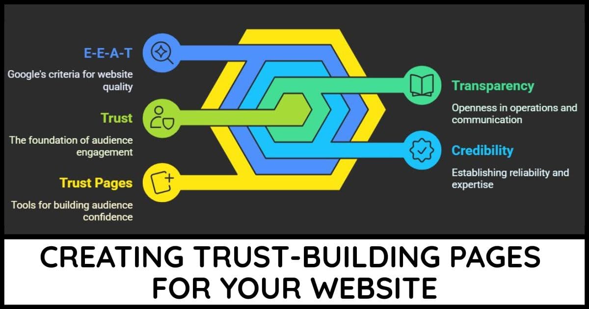
In the next chapter, we'll dive into creating key trust-building pages like your About page, Contact page, and essential legal disclaimers.
These pages not only protect you legally but also make your visitors feel confident and safe when engaging with your site.